ACTIVATION- AGRO TOURISM BRAND
Client
Industry
Role
Deliverables
Year
April 2024
Client
BACKGROUND
Ranwara, an agro-tourism sanctuary where rural life and sustainability come alive.
A space designed to reconnect people with nature, Ranwara blends organic farming with immersive rural experiences. Established in 2018, it offers wholesome products, traditional methods and authentic community living- creating a retreat that nourishes both people and the planet.
OBJECTIVE & GOAL
As the UX designer, I was tasked to build strategy and direction for the brand- a distinctive, nature-first identity rooted in sustainability and rural authenticity
The aim was to shape a warm, farmer-positive brand identity that celebrates community, cultural preservation and healthy living. This included codifying guidelines for logo, type, color, tone, and assets- ensuring seamless application across on-site experiences, packaging, signage, merchandise and digital platforms.


Ranwara’s strategy was built around its mission to offer natural products and sustainable living. Founder conversations and benchmarking revealed a tension in the category: agro-tourism brands often skewed either too rustic, risking credibility with urban visitors, or too polished, losing authenticity for local communities.
Research clarified two key audiences- local rural enthusiasts and new-age urban spenders seeking meaningful weekend escapes. Urban visitors, in particular, desired authenticity tempered with comfort: the rawness of the farm. This insight set the brand’s direction: anchor the identity in rural values like sustainability and cultural preservation, while packaging it with modern clarity.


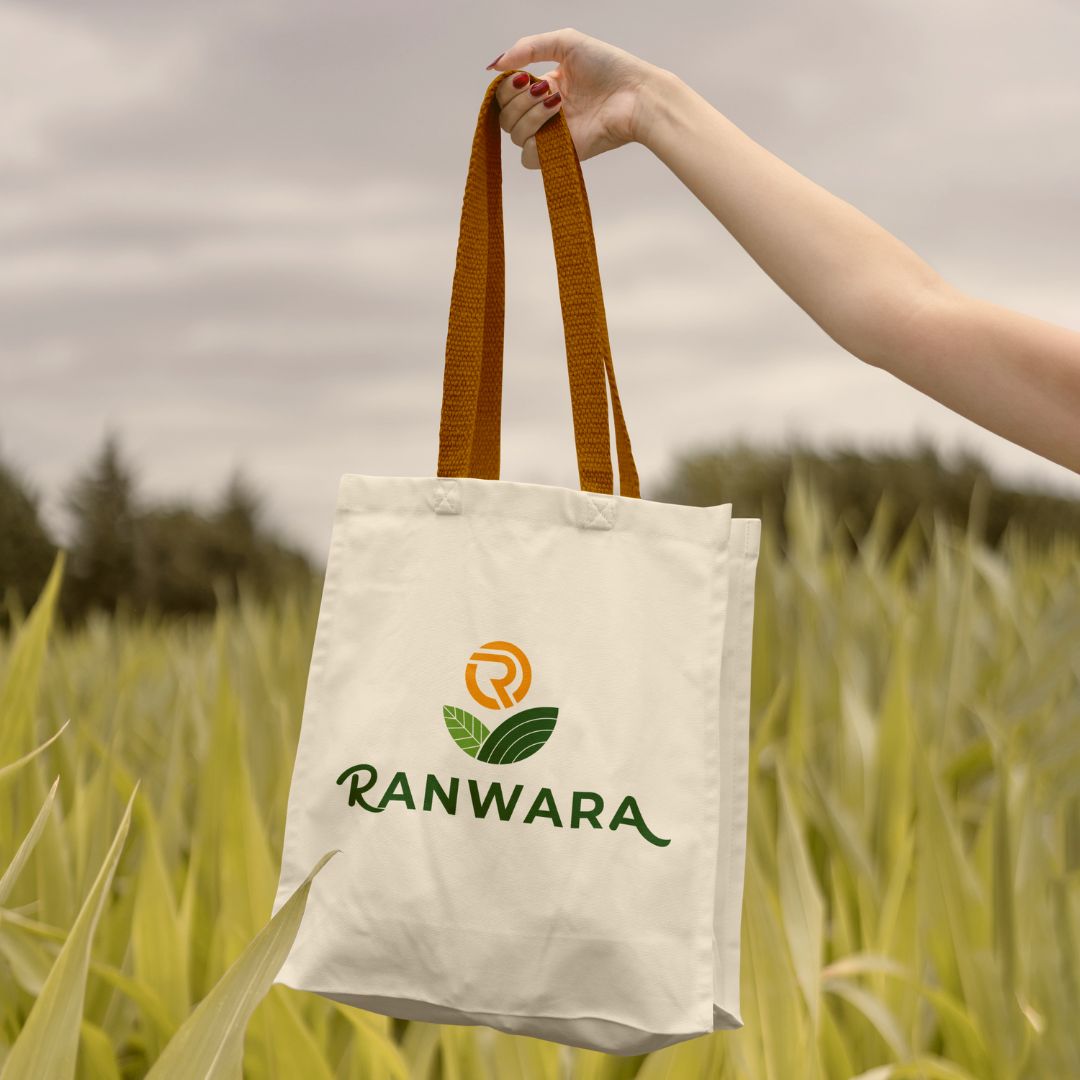
Ranwara’s identity was crafted for a new generation of urban visitors seeking authentic rural escapes with a touch of polish. The logo system balances rustic warmth with professional clarity, while the type system bridges friendliness and modernity through Cooper Medium BT for headings and Quicksand Light for body text. An earthy palette of deep soil and olive grounds the brand, complemented by festive accents of red and saffron, softened with sand tones to create an inviting, celebratory atmosphere.
Extending beyond visuals, the communication framework reinforces the values of natural quality, sustainability, and community spirit. With a voice that is both educational and welcoming, messaging flows seamlessly across channels. Together, the visual and verbal systems create an immersive identity- authentic to the farm setting yet aspirational.

The new identity elevated Ranwara from a promising agro-tourism project into a brand with clarity, credibility, and emotional resonance. For local communities, it conveys authenticity and respect for cultural traditions. For urban visitors, it signals a premium yet welcoming experience- one that promises both escape and belonging. With this foundation, the brand is ready to attract new-age spenders, deepen visitor engagement and scale its offerings while staying true to its ethos.